Indanthrene Blue watercolor is a transparent primary blue with a warmer temperature than most blues similar in color to French Ultramarine, but it is a more saturated, intense, staining color.
It is one of the “blues” in the transparent staining watercolor palette used for the glazing technique and mixing with other colors in its category.
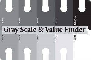
Measured against a gray scale value finder, transparent staining watercolors range in value from 10% light to a maximum of 90% dark.
Colors in the transparent staining category can portray intensity and dark values without becoming muddy and are adequate for a full palette except for where opacity is desired.
PAINT CHARACTERISTICS
Indanthrene Blue is a supersaturated, stronger color than watercolors in the non-staining category and more restraint is required when mixing or glazing it with other watercolors.
Transparent staining watercolors will stain the fibers of the paper they are applied to, and stain, overpower and dull non-staining watercolors they are mixed with.
For the best results, Indanthrene Blue can be glazed and mixed with colors in the transparent staining watercolor category.
COLOR MIXING WITH INDANTHRENE BLUE WATERCOLOR
Indanthrene Blue wets, mixes, stains, and dries like a phthalo blue which has interesting results when mixed with other primary colors.
Add Winsor Yellow or Winsor Red to Indanthrene Blue to mix a variety of transparent staining green and purple colors that are clear and vibrant.
Mix Indanthrene Blue with an orange mixture of Winsor Yellow plus Winsor Red to create interesting mid-value transparent gray colors. For a darker gray, mix it with Permanent Yellow Deep plus Winsor Red.
Transparent staining watercolors can be layered one over another, wet over bone dry, successfully as long as the number of layers and density is controlled.
Before applying a layer of color from another category, use the transparent staining watercolor as the first layer.
Interesting textures and effects can be achieved by painting opaque colors over a layer of transparent staining watercolor and allowing some of the staining color to peek through using various lifting methods.
Semi-opaque or opaque colors are composed of coarser pigments that are stained and discolored when mixed with transparent staining watercolors. So, they are the least successful combinations.
Purchase watercolor paints using my affiliate links below:
… and the recommended transparent staining watercolor for mixing grays with Indanthrene Blue
… in addition to the above list of colors, the following transparent staining watercolors are best for glazing or color mixing with Indanthrene Blue
- Carmine
- Alizarin Crimson
- Winsor Violet
- Permanent Violet
- Winsor Blue GS
- Winsor Blue RS
- Winsor Green BS
- Permanent Green #1
- Hooker’s Green Light
- Winsor Green YS
To learn more about transparent watercolors, click the link to my blog post “Which Watercolor Paints Are Transparent.”
See my YouTube playlist “Watercolor Paint Characteristics & Color Mixing” for more videos. And, subscribe to my YouTube channel.