Categories
Color Schemes

Watercolor Schemes Triadic

Watercolor schemes – Triadic is a color scheme using three colors on the color wheel. To locate a Triadic scheme on the color wheel, an equilateral triangle could be drawn with each of its points pointing to three equidistant colors forming a triad chord.

There are four triad color groups on a color wheel, as follows:

  • Primary Triad – Yellow > Blue > Red
  • Secondary Triad – Green > Purple > Orange
  • Tertiary Triad #1 – Yellow-Green > Blue-Purple > Red-Orange
  • Tertiary Triad #2 – Blue-Green > Red-Purple > Yellow-Orange

For corresponding watercolor paint names for the above see What Watercolors To Buy.

NOTE: The hue PURPLE is labeled as the color VIOLET by most watercolor paint brands.

The Primary Triad color scheme allows for mixing all of the Secondary and Tertiary colors using the Primary colors Yellow, Blue and Red.

All of the Triad groups allow for an almost endless array of colors, neutrals, and grays by varying the proportion of each color mixed.

In a composition, make one of the triad colors the main color. Add interest by mixing small amounts of one of the other triad colors into the main color to create neutrals and grays. Add accents using the remaining triad color. Place two of the triad colors side-by-side or near each other at the focal point of the composition to draw the viewer’s eye to the center of interest.

Why Triadic Watercolor Schemes Feel Dynamic

Triadic color schemes are visually dynamic because the colors are evenly spaced around the color wheel. This spacing creates a sense of balance combined with lively contrast, encouraging the viewer’s eye to move throughout the composition without feeling chaotic.

In watercolor painting, this effect is enhanced by:

  • Transparent washes that allow colors to visually mix on the paper
  • Soft edges and blooms that naturally harmonize contrasting hues
  • Granulating pigments that add texture while maintaining color balance

Because of this, triadic watercolor schemes are especially effective for expressive landscapes, florals, still lifes, and abstract compositions.

Value Control in Triadic Watercolor Painting

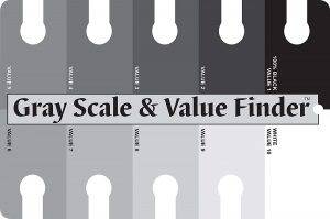
When working with three equally spaced hues, value control becomes more important than color choice. Without strong value structure, a triadic painting can feel busy or overwhelming. Use a gray scale to determine a color’s tonal value.

To maintain harmony:

  • Assign one triad color a light value, one a middle value, and one a dark value
  • Use diluted washes for secondary and supporting colors
  • Reserve the strongest saturation and contrast for focal points

Careful value planning allows the triadic scheme to feel cohesive while retaining its natural energy.

Mixing Neutrals and Grays Using Triadic Colors

Triadic color schemes are particularly effective for mixing rich, luminous neutrals.

  • Mixing two triad colors produces warm or cool grays depending on which color dominates
  • Mixing all three triad colors creates complex neutrals with depth and variation
  • Introducing the third color gradually helps control temperature and avoid overmixing

These neutrals often appear more vibrant and natural than premixed gray paints, especially in watercolor.

When to Choose a Triadic Color Scheme

Triadic watercolor schemes are an excellent choice when:

  • A composition includes multiple areas of interest
  • You want more flexibility than a complementary color scheme
  • The subject benefits from varied color relationships without strong opposition

Compared to complementary schemes, triadic schemes offer greater range while still maintaining harmony.

Common Mistakes With Triadic Watercolor Schemes

Avoid these common pitfalls when working with triadic color schemes:

  • Using all three colors at full saturation
  • Giving each color equal visual dominance
  • Overmixing until colors become dull or muddy
  • Ignoring temperature differences within each hue

A simple guideline is to feature one color, support with one, and accent with the third.

Pigment Behavior and Triadic Harmony

Pigment characteristics play a significant role in the success of a triadic palette.

  • Granulating pigments create softer, atmospheric triads
  • Staining pigments produce bold, modern color relationships
  • Opaque pigments tend to mute contrasts and create earthy triads

Understanding pigment behavior helps maintain clarity and harmony when mixing and layering washes.

Compatible Triadic Watercolor Palettes

Ideal Subjects for Triadic Watercolor Schemes

Triadic schemes work particularly well for:

  • Florals with varied petal and foliage colors
  • Urban and street scenes
  • Still lifes featuring multiple materials or surfaces
  • Skies, water, and expressive natural scenes

These subjects benefit from the balance and movement inherent in triadic color relationships.

Categories
Color Schemes Watercolor Paint

Cadmium Orange

In the past, I used Cadmium Orange as the tertiary yellow-orange on the color wheel. It is a pure color that is perfect for its complementary color listed below. But, there are newer paint color alternatives that I prefer now. They are Transparent Orange and Cadmium-Free Orange. Why? Because Cadmium paints are toxic. So, I avoid using them.

Understanding Cadmium Orange on the Palette

Cadmium Orange is known for its strong chroma and distinctly opaque nature. Unlike transparent watercolor pigments that allow light to pass through the paint layers and reflect back from the paper, Cadmium Orange blocks light. This opacity causes the color to sit more heavily on the paper surface, which affects both layering and mixing.

Because of this, Cadmium Orange does not glaze well and can quickly dull mixtures when combined with transparent pigments. While it produces bold, solid color in a single layer, it often lacks the luminosity that many watercolor artists seek in modern transparent palettes.

Cadmium Orange vs. Modern Transparent Alternatives

Advances in pigment technology have made it possible to achieve vibrant orange hues without the drawbacks of cadmium paints.

  • Transparent Orange offers high chroma with excellent transparency, making it ideal for glazing, color layering, and clean mixes.
  • Cadmium-Free Orange provides a similar visual warmth to Cadmium Orange without the toxicity, though it may differ slightly in intensity or undertone depending on the manufacturer.

These modern alternatives support luminous watercolor techniques while maintaining safety and versatility in the studio.

Temperature and Color Bias of Cadmium Orange

Cadmium Orange is a warm orange with a noticeable yellow bias. This warmth influences how it behaves in mixes:

  • Mixed with blues or blue-violets, it tends to create muted neutrals rather than vibrant secondaries.
  • When combined with yellows, it produces strong, earthy yellow-orange passages.
  • With reds, it can quickly overpower the mixture due to its opacity.

Understanding this color bias helps predict results and avoid muddy mixes.

Color Schemes Using Cadmium Orange

The following color schemes are based on Stephen Quiller’s “Quiller Color Wheel” and his book “Color Choices: Making Color Sense Out of Color Theory.

Complementary

The complementary color sits on the opposite side of the color wheel. For Cadmium Orange, the complementary color is:

Split-Complementary

The split-complementary colors are the two colors located on either side of the complementary color on the color wheel. The following are the split-complementary colors for Cadmium Orange:

Analogous

Going clockwise on the color wheel from YELLOW-ORANGE to YELLOW-GREEN the analogous colors for Cadmium Orange are:

Triadic

This Triadic consists of three INTERMEDIATE colors. In addition to Cadmium Orange, the other colors that make up this Triadic color scheme are:

Opacity, Mixing, and Layering Effects

Because Cadmium Orange is opaque, it can flatten underlying washes when layered on top of transparent colors. This characteristic makes it less suitable for traditional watercolor glazing techniques but more appropriate for:

  • Single-layer applications
  • Flat color areas
  • Graphic or illustrative styles

In contrast, transparent oranges maintain color harmony and optical depth when layered.

Lightfastness vs. Watercolor Technique

Historically, cadmium pigments were prized for their excellent lightfastness, which made them attractive to artists concerned about permanence. However, permanence alone does not guarantee successful watercolor behavior.

Modern transparent pigments now offer both lightfastness and superior handling qualities, allowing artists to achieve longevity without sacrificing luminosity or clean mixing.

Safety Considerations When Using Cadmium Pigments

Cadmium paints are toxic, particularly if inhaled or ingested. While safe handling practices can reduce risk, many artists prefer to eliminate cadmium pigments entirely—especially in home studios, shared workspaces, or teaching environments.

Cadmium-free alternatives provide a safer and more practical choice for everyday watercolor use.

When Cadmium Orange May Still Be Useful

Although no longer part of my regular palette, Cadmium Orange can still be useful in limited situations, such as:

  • Painting autumn foliage or rustic subjects
  • Creating muted, earthy neutrals
  • Working in styles that favor opacity over transparency

Used thoughtfully, it can serve a specific visual purpose rather than a primary mixing role.

Categories
Color Schemes

Watercolor Schemes Split-Complementary

Watercolor schemes – Split-complementary is a color scheme using three colors on the color wheel as follows:

  • One Primary plus two Tertiary colors that sit on either side of the Primary color’s true complement, or
  • One Secondary plus two Tertiary colors that sit on either side of the Secondary color’s true complement.

To locate a split-complementary scheme on the color wheel, an isosceles triangle could be drawn with the narrowest angle pointing to a Primary color (or Secondary color). The other two points at the opposite end of the isosceles triangle would point to the two Tertiary colors forming a split-complementary harmony.

Because each of the “split” colors has some of the other primaries in them, a broader color capacity with a more pleasing harmony is achieved. This color scheme also allows for mixing a larger range of neutrals and grays by varying the proportion of each color.

In a composition, make one of the split-complementary colors the main color. Add interest by mixing small amounts of one of the other “split” colors into the main color to create neutrals and grays. Add accents using the remaining “split” color. Place two of the “split” colors side-by-side or near each other at the focal point of the composition to draw the viewer’s eye to the center of interest.

Color Wheel Split-Complements

  • Yellow > Red-Purple < > Blue-Purple
  • Blue > Red-Orange < > Yellow-Orange
  • Red > Yellow-Green < > Blue-Green
  • Green > Red-Orange < > Red-Purple
  • Purple > Yellow-Orange < > Yellow-Green
  • Orange > Blue-Green < > Blue-Purple

For corresponding watercolor paint names for the above see What Watercolors To Buy.

NOTE: The hue PURPLE is labeled as the color VIOLET by most watercolor paint brands.

Why Split-Complementary Color Schemes Work Especially Well in Watercolor

Split-complementary color schemes are particularly well suited to watercolor painting. Unlike direct complementary pairs, which can feel abrupt or overpowering, split-complements soften contrast while maintaining visual energy. Because watercolor relies on transparency and light passing through layered washes, the slightly wider spacing between hues helps preserve luminosity and reduce the risk of muddy mixtures.

This makes split-complementary palettes an excellent choice for artists who want both harmony and contrast without sacrificing clarity.

Understanding Pigment Bias in Split-Complementary Watercolor Schemes

In watercolor, pigment bias often matters more than the theoretical placement of colors on the color wheel. Two paints with the same color name may lean warm or cool, which significantly affects how split-complementary mixtures behave.

For example, a warm blue such as Ultramarine Blue will neutralize differently with yellow-orange and red-orange than a cool blue such as Phthalo Blue. Choosing pigments that lean away from the opposite split can help maintain cleaner mixes and more predictable neutrals.

This reinforces the importance of selecting artist-grade pigments intentionally when working with split-complementary schemes.

Mixing Luminous Neutrals and Grays with Split-Complements

One of the greatest strengths of split-complementary color schemes is their ability to produce expressive, luminous neutrals. By adjusting the ratio of the three colors, artists can create a wide range of chromatic grays that feel alive rather than dull.

Layering colors through glazing, instead of mixing them fully on the palette, allows light to pass through each layer and enhances depth. Water control also plays a key role, as wetter washes create softer neutralization while drier applications result in stronger, more textured color interactions.

Value Control for Strong Split-Complementary Compositions

When using a split-complementary palette, value contrast often has a greater impact than hue contrast. Keeping two of the colors closer in value while allowing one color to dominate helps maintain balance and visual flow.

Lighter washes of the split colors combined with deeper values of the dominant color can unify the painting. Reserving the strongest value contrast for the focal area reinforces the center of interest without overwhelming the composition.

Common Pitfalls When Using Split-Complementary Schemes

While versatile, split-complementary schemes can present challenges if not handled thoughtfully:

  • Over-mixing all three colors equally can result in dull, lifeless washes
  • Using all three colors at full intensity across the painting can create visual chaos
  • Poor water control may cause unintended neutralization directly on the paper

Being mindful of dominance, proportion, and water-to-pigment ratios helps avoid these issues.

Suggested Limited Palettes for Practicing Split-Complementary Watercolor

Practicing with a limited split-complementary palette helps build confidence and color intuition. Consider experimenting with combinations such as:

Each triad offers a different balance of transparency, granulation, and mixing potential.

Best Subjects for Split-Complementary Watercolor Schemes

Split-complementary color schemes are especially effective for:

  • Floral and botanical paintings
  • Atmospheric and expressive landscapes
  • Still lifes with a clear focal point
  • Semi-abstract and expressive compositions

Their balance of harmony and contrast makes them adaptable to both realistic and interpretive watercolor styles.

By understanding how split-complementary color schemes interact with watercolor pigments, water, and layering techniques, artists can use this palette with greater intention and confidence, creating paintings that feel both dynamic and unified.

Categories
Color Schemes

Watercolor Schemes Complementary

Watercolor schemes – Complementary is a color scheme using two colors that lie directly across from each other on the color wheel, such as Yellow and Purple. A straight line could be drawn connecting the two colors on the opposite sides of the wheel. They are considered complements or opposites.

Complementary pairs consist of one Primary and one Secondary color, or two Tertiary colors. One color in the pair is warm and the other is cool.

When the two complementary colors are placed side-by-side in a composition the colors intensify each other. Mixing two complementary colors together results in a neutralized color to a grayed color. A variety of neutrals and grays can be mixed by varying the proportion of one color to the other.

In a composition, make one of the complementary colors the main color. Add interest by mixing small amounts of its complement into the main color to create neutrals and grays. Add accents using the opposite color. Place the two colors side-by-side or near each other at the focal point of the composition to draw the viewer’s eye to the center of interest.

Understanding Complementary Colors and Pigment Bias

Not all complementary colors behave the same in watercolor. Individual pigments lean warm or cool, which affects how quickly they neutralize when mixed.

  • Warm complements mixed together tend to gray or brown more quickly.
  • Cool complements usually create cleaner, softer neutrals.
  • Single-pigment artist-grade paints provide more predictable results when working with complementary schemes.

Understanding pigment bias helps painters control whether a mixture becomes luminous, earthy, or subdued.

Using Complementary Colors to Create Shadows

Complementary colors are an excellent alternative to using black for shadows.

  • Shadows often contain a subtle hint of the object’s complementary color.
  • Adding a touch of purple to yellow areas or red to green foliage creates shadows that feel natural and cohesive.
  • This method maintains color harmony while preserving watercolor’s transparency.

Simultaneous Contrast in Complementary Color Schemes

Complementary colors intensify each other when placed side-by-side.

  • A small amount of orange next to blue appears brighter than the same orange used alone.
  • This optical effect allows painters to achieve strong visual impact with minimal paint.

Because of this, complementary schemes are especially effective for focal points.

Mixing Complementary Colors for Neutrals and Grays

Complementary colors can produce a wide range of neutrals.

  • Adjusting the ratio of one color to the other creates warm or cool grays.
  • These neutrals feel more connected to the painting than pre-mixed gray or black.

This approach is particularly effective in landscapes, still lifes, and architectural subjects.

Granulating vs. Non-Granulating Complementary Colors

Pigment texture plays an important role in complementary mixtures.

  • Granulating pigments can separate slightly on the paper, creating lively, textured neutrals.
  • Non-granulating pigments produce smoother, more even washes.

Choosing granulating complements intentionally can enhance skies, stone, foliage, and textured surfaces.

Glazing Complementary Colors in Watercolor

Complementary colors behave differently when layered instead of mixed.

  • Glazing one complementary color over another preserves depth and luminosity.
  • Mixing complements on the palette neutralizes color more quickly.

Glazing allows greater control over value and temperature while maintaining transparency.

Complementary Color Relationships Found in Nature

Complementary color schemes are common in natural subjects.

  • Blue skies against warm earth tones
  • Red berries surrounded by green foliage
  • Orange sunsets contrasted with deep blue shadows

Recognizing these relationships helps painters apply complementary schemes intuitively.

Common Mistakes When Using Complementary Color Schemes

Being aware of common pitfalls helps maintain color harmony.

  • Overmixing complementary colors can lead to dull or muddy washes.
  • Using equal amounts of both colors can create visual tension.
  • Establishing a dominant color is essential for balance.

Restraint and intentional placement lead to stronger compositions.

Simple Complementary Color Practice Exercise

To explore complementary color schemes:

  • Choose one dominant color.
  • Mix small amounts of its complement into the dominant color to create neutrals.
  • Use the pure complementary color sparingly at the focal point.

This exercise builds confidence and control.

Color Wheel Complements

  • Yellow < > Purple (Violet)
  • Yellow-Green < > Red-Purple (Red-Violet)
  • Green < > Red
  • Blue-Green < > Red-Orange
  • Blue < > Orange
  • Yellow-Orange < > Blue-Purple (Blue-Violet)

For corresponding watercolor paint names for the above see What Watercolors To Buy.

NOTE: The hue PURPLE is labeled as the color VIOLET by most watercolor paint brands.

Complementary vs. Split-Complementary Color Schemes

A complementary color scheme uses two colors directly opposite each other on the color wheel, creating strong contrast and visual energy.

A split-complementary scheme softens this contrast by replacing one complement with the two colors adjacent to it. This results in a more complex palette with less visual tension while still maintaining contrast.

Complementary schemes are bold and direct, while split-complementary schemes offer greater flexibility and subtlety. Both are powerful tools when used intentionally.

Categories
Color Schemes

Watercolor Schemes Analogous

Watercolor schemes – Analogous is a color scheme using three or four adjacent colors on the color wheel that share the same PRIMARY color. An analogous color scheme is harmonious because of the subtle gradation from one color to the next. Using this scheme creates a strong suggestion of illumination with its changes in value and intensity.

The analogous color scheme can become monotonous. It is best to choose one dominant color and use the remaining analogous colors to accent it. A small amount of a complementary color can also be added for variety and contrast.

Analogous Colors

  • Yellow-Orange, YELLOW, Yellow-Green, Green
  • Blue-Green, BLUE, Blue-Purple, Purple
  • Red-Purple, RED, Red-Orange, Orange

NOTE: Yellow, blue and red are PRIMARY colors.

Complementary Colors for Contrast

  • For the Yellow analogous colors use one of these complements: Blue-Purple, Purple, Red-Purple
  • For the Blue analogous colors use one of these complements: Yellow-Orange, Orange, Red-Orange
  • For the Red analogous colors use one of these complements: Yellow-Green, Green, Blue-Green

For corresponding watercolor paint names for the above see What Watercolors To Buy.

Why Analogous Color Schemes Work Especially Well in Watercolor

Analogous color schemes are particularly effective in watercolor because they support the medium’s natural transparency and optical mixing.

  • Adjacent colors flow into one another easily when painted wet-into-wet.
  • Transparent pigments layered within an analogous range maintain luminosity.
  • Color transitions appear soft and natural rather than abrupt.

These qualities make analogous schemes ideal for atmospheric effects, glowing light, and expressive color passages.

Choosing Temperature Within an Analogous Scheme

Even within a harmonious color range, temperature variation adds depth and visual interest.

  • Warm versions of a color suggest sunlight and proximity.
  • Cooler versions recede and create a sense of distance.
  • A warm dominant color balanced with cooler accents (or vice versa) prevents the painting from feeling flat.

Being intentional about warm and cool shifts strengthens realism and enhances mood.

Value Control: Preventing Flat or Overly Soft Paintings

Because analogous schemes rely on subtle hue shifts, value contrast becomes especially important.

  • Establish a clear range of light, mid, and dark values. Use a gray scale to determine color values.
  • Use darker values of the dominant color to anchor the composition.
  • Reserve lighter values for focal areas or highlights.

Strong value structure ensures the painting reads clearly even with limited hue contrast.

Best Subjects for Analogous Color Schemes in Watercolor

Certain subjects naturally lend themselves to analogous harmony:

  • Landscapes: Yellow–green–blue-green for foliage and fields
  • Seascapes: Blue–blue-green–blue-purple for water and sky
  • Florals: Red–red-orange–orange for warmth and vibrancy
  • Atmospheric scenes: Blue–purple–red-purple for twilight and shadow

Matching subject matter to the color scheme reinforces visual unity.

Pigment Selection Matters More Than Hue Labels

Not all watercolor paints behave the same, even when they share similar color names.

  • Single-pigment paints mix more cleanly within analogous schemes.
  • Granulating pigments add texture and visual interest.
  • Staining pigments intensify transitions but are difficult to lift or soften.

Choosing pigments with similar transparency and handling characteristics helps maintain harmony throughout the painting.

Using Neutrals Without Breaking Color Harmony

Neutrals do not need to come from black or gray paint.

  • Mix adjacent analogous colors together to create soft neutrals.
  • Add water rather than darker pigments to control intensity.
  • Use complementary colors sparingly to mute saturation without overpowering the scheme.

This approach preserves color harmony while increasing complexity.

Common Mistakes When Using Analogous Color Schemes

  • Giving equal importance to all colors instead of choosing a dominant hue
  • Relying on color alone and ignoring value contrast
  • Overusing the complementary accent color
  • Mixing incompatible pigments that dull the painting

Avoiding these issues keeps the scheme lively and intentional.

Practice Exercise: Analogous Color Scheme Study

  1. Choose three analogous colors plus one optional complementary color.
  2. Select a simple subject such as a leaf, sky study, or sphere.
  3. Establish light, mid, and dark values using only the analogous colors.
  4. Add the complementary color sparingly (no more than 10% of the composition).

This exercise strengthens color control and builds confidence using harmonious palettes.

Categories
Color Schemes

Watercolor Schemes Monochromatic

Watercolor schemes – Monochromatic is a color scheme using only one color in a range of tonal values that are light, medium and dark in a painting composition. Black, Neutral Tint or Payne’s Gray may also be added to darken the color and range of values. And, white space may also be planned for the composition by leaving areas of the watercolor paper unpainted.

A range of tonal values are achieved by adding more water to the watercolor paint to lighten it in stages.

Choosing the Best Color for a Monochromatic Watercolor Scheme

Not all watercolor pigments perform equally well in a monochromatic color scheme. Some pigments naturally produce a wide range of values from very light to very dark, while others have a limited value range.

Pigments such as Indigo, Payne’s Gray, Phthalo Blue, Burnt Sienna, Sepia, and Ultramarine Blue are especially effective for monochromatic paintings because they can achieve deep darks without losing color strength. In contrast, many yellow and some red pigments have difficulty reaching darker values without appearing dull or weak.

Staining pigments tend to create strong, even washes, while non-staining pigments allow for easier lifting and correction. Understanding how a pigment behaves will help you choose a color that supports your composition rather than limiting it.

Emotional Impact of Monochromatic Color Schemes

Monochromatic watercolor schemes are powerful tools for expressing mood and atmosphere. Because the viewer is not distracted by multiple hues, emotional impact is carried through value, contrast, and subject matter.

  • Blue monochromatic schemes often convey calm, quiet, or melancholy moods
  • Green monochromatic schemes suggest growth, harmony, and nature
  • Red monochromatic schemes communicate energy, drama, or tension
  • Earth-tone monochromatic schemes create warmth, nostalgia, or a sense of history

Choosing a single color intentionally allows the artist to reinforce the emotional message of the painting.

Monochromatic Composition

To be effective, a monochromatic color scheme requires a lot of planning to add variety while working with only one color.

  • Plan a source of light
  • Plan a focal point
  • Plan white areas
  • Plan dark value areas
  • Plan middle value areas
  • Plan light value areas, and
  • Plan highlights

Strong value contrast is essential in monochromatic compositions to prevent the painting from appearing flat or monotonous.

Creating Variety Through Texture and Brushwork

When working with only one color, texture and brushwork become critical design elements. Visual interest can be created by varying how the paint is applied.

  • Use wet-on-wet techniques for soft transitions and atmospheric areas
  • Use dry brush for texture, especially in light and middle values
  • Layer transparent washes to gradually build depth
  • Take advantage of granulating pigments to create natural variation

These techniques help replace the variety that would normally come from multiple colors.

Temperature Shifts Within a Single Color

Even though only one color is used, subtle temperature shifts can still occur within a monochromatic painting. Highly diluted washes often appear cooler and lighter, while more concentrated pigment tends to feel warmer and heavier.

Adding Neutral Tint or Payne’s Gray to darken a color can also affect temperature because both paint colors contain PB15-Phthalo Blue pigment. Neutral Tint may cool the mixture, while Payne’s Gray can introduce a blue bias. Being aware of these shifts helps maintain harmony while adding depth.

Value Scale

A gray scale or value finder is a helpful tool to use for showing the transitions between white to black in measuring the values of the subject and for planning the visual direction of a composition.

In watercolor painting, work from light to dark by painting the lightest values first. Middle values are added next. The final, darker tones are added last.

Painting a light value adjacent to a dark value at the focal point of the composition draws the viewers eye to that area of the painting.

Common Mistakes in Monochromatic Watercolor Paintings

Artists new to monochromatic schemes often encounter similar challenges.

  • Not pushing dark values far enough, resulting in low contrast
  • Overusing black and losing color harmony
  • Filling in too much white space
  • Keeping middle values too similar, which weakens structure

Avoiding these issues will strengthen both the composition and the overall impact of the painting.

Monochromatic Watercolor as a Skill-Building Exercise

Monochromatic watercolor painting is an excellent practice method for developing foundational skills. It encourages artists to focus on value, light direction, and composition without relying on color contrast.

These studies are often used for:

  • Value and light studies
  • Underpaintings
  • Architectural subjects
  • Atmospheric landscapes
  • Portrait practice

Mastering monochromatic schemes builds confidence and prepares artists for more complex color combinations.

When to Use a Monochromatic Color Scheme

Monochromatic schemes are not only exercises but intentional design choices. They are especially effective when the goal is unity, mood, or clarity of form.

This approach works well for:

  • Expressive studies
  • Limited palette compositions
  • Interior design and wall art planning
  • Series work where cohesion is important

A well-planned monochromatic watercolor painting demonstrates strong technical control and a deep understanding of value.

Categories
Color Schemes Watercolor Paint

Prussian Blue

Prussian Blue is a deep, moody blue valued for its strength, staining power, and ability to create luminous darks. It is especially prized by watercolor artists for producing transparent near-blacks and dramatic shadow mixtures without the deadening effect of tube blacks.

Understanding Prussian Blue on the Palette

Prussian Blue sits on the cool blue side of the color wheel and leans slightly toward green, though it is more neutralized than high-chroma blues such as Winsor Blue. This subtle neutrality gives it tremendous versatility, particularly in shadow work and dark passages.

Because it is semi-transparent and staining, Prussian Blue excels in layered washes and deep value building. It is not a delicate blue; instead, it is a workhorse pigment used for structure, depth, and atmosphere.

Pigment Information: What Prussian Blue Is Made Of

Prussian Blue is made from Iron Blue (PB27), one of the earliest synthetic pigments.

Typical characteristics include:

  • Semi-transparent
  • Strong staining behavior
  • High tinting strength
  • Minimal granulation
  • Excellent depth at low dilution

PB27 is known for its ability to create very dark values while remaining transparent, a rare and valuable quality in watercolor.

Handling & Mixing Characteristics

Prussian Blue is known for:

  • Rapid value buildup
  • Strong staining of paper fibers
  • Smooth, even washes

Because of its staining strength:

  • It is difficult to lift once dry
  • It should be used with a light hand
  • Small amounts significantly affect mixtures

It mixes especially well with reds and greens to produce rich, neutral darks.

Why Prussian Blue Works Well in Color Theory Systems

As a cool, dark blue, Prussian Blue:

  • Creates strong value contrast
  • Produces transparent neutrals instead of flat blacks
  • Supports sophisticated shadow mixtures

Its neutrality allows it to function as a darkening agent without overwhelming color relationships.

Use Prussian Blue for Dark Backgrounds

Prussian Blue is similar to Winsor Blue, but it is a neutralized semi-transparent staining watercolor. I mix Prussian Blue with Alizarin Crimson and Viridian to create strong darks for backgrounds and to darken other colors.

This dark mixture is almost black, but is still transparent. I use it instead of black tube paints such as Ivory Black, Neutral Tint, Payne’s Gray, etc. which have an undesirable flat appearance.

Color Schemes Using Prussian Blue

Prussian Blue’s complement on the traditional color wheel is a shade of red-orange, but in watercolor, artists often use warm reds and burnt sienna to neutralize it or create rich, earthy browns and grays, with orange/gold offering vibrant contrast and reds/browns creating sophisticated shadows.

Key Complementary Colors & Uses:

  • Cadmium Scarlet: Painting Prussian Blue adjacent to a vibrant red-orange, creates an energetic contrast, making the blue pop.
  • Light Red / Burnt Sienna: Mixing Prussian Blue with reds/browns creates beautiful, deep, cool grays and muted browns, perfect for shadows or stormy skies.
  • New Gamboge / Cadmium Yellow: Mixing Prussian Blue with warm yellows creates olive greens, while cooler yellows make brighter greens, though these are analogous, not complementary.

Why This Matters for Watercolor:

  • Neutralizing: Adding a touch of its complement (like Cadmium Scarlet or Light Red) to Prussian Blue cools it down and dulls its intensity, making sophisticated grays.
  • Shadows: Mixing Prussian Blue with its reddish or brownish complement creates realistic, rich shadow colors, as pure blue shadows can look flat.

Prussian Blue Compared to Other Blues

Prussian Blue excels where depth and darkness are needed without sacrificing transparency.

Best Uses for Prussian Blue

Prussian Blue is particularly effective for:

  • Dark backgrounds
  • Night scenes and stormy skies
  • Deep water passages
  • Shadow construction
  • Neutral dark mixing without black

Limitations of Prussian Blue

Despite its strengths, Prussian Blue:

  • Can easily overpower mixtures
  • Is difficult to lift due to staining
  • Can appear heavy if overused

It benefits from dilution, restraint, and thoughtful pairing with warmer pigments.

A Note on Prussian Blue’s Role on the Palette

Prussian Blue is a structural, atmospheric color rather than a decorative one. Its ability to produce transparent, luminous darks makes it indispensable for artists who want depth and realism without relying on premixed blacks. Used intentionally, it adds sophistication, drama, and control to watercolor palettes.

Categories
Color Schemes Watercolor Paint

French Ultramarine

French Ultramarine is a classic, expressive blue prized for its warmth, granulation, and versatility. It is one of the most widely used blues in watercolor because of its ability to create both luminous passages and richly textured darks without overwhelming other colors.

Understanding French Ultramarine on the Palette

French Ultramarine occupies a warm blue position on the color wheel, leaning toward violet rather than green. This placement allows it to create depth and atmosphere while maintaining harmony with both warm and cool colors.

Because it is semi-transparent and non-staining, French Ultramarine excels in layered washes, soft transitions, and passages where subtle color variation and texture are desired. Its warmth makes it especially effective for shadow work and spatial recession.

Pigment Information: What French Ultramarine Is Made Of

French Ultramarine is made from Ultramarine Blue (PB29), a synthetic inorganic pigment originally developed as a replacement for natural lapis lazuli.

Typical characteristics include:

  • Semi-transparent
  • Warm blue-violet bias
  • Strong natural granulation
  • Moderate tinting strength
  • Excellent lightfastness

PB29 is valued for its stability, predictability, and distinctive textural qualities.

Granulation & Handling Characteristics

French Ultramarine is known for:

  • Pronounced granulation
  • Soft, broken color in washes
  • Expressive texture on cold-press and rough paper

Because it is non-staining:

  • It can be lifted more easily than staining blues
  • It responds well to rewetting
  • It layers beautifully without becoming heavy

These properties make it especially well suited for atmospheric landscapes and painterly techniques.

Why French Ultramarine Works Well in Color Theory Systems

As a warm blue, French Ultramarine:

  • Produces rich neutrals with earth colors
  • Creates natural shadow mixtures
  • Maintains clarity in both complementary and analogous relationships

Its moderate strength makes color interactions easy to control and visually informative.

Color Schemes Using French Ultramarine

French Ultramarine is one of my favorite blues. It is a warm semi-transparent non-staining watercolor that mixes well with other transparent non-staining colors. It is a good color to use as foreground shadows.

Burnt Sienna and Burnt Umber complement French Ultramarine when juxtaposed in a composition.

Complementary Relationships

Warm earth colors such as Burnt Sienna and Burnt Umber provide strong complementary contrast to French Ultramarine. When mixed, these pairings create a wide range of expressive neutrals ideal for shadows, architecture, and landscape forms.

Analogous Relationships

Sitting between Winsor Blue (Green Shade) and Ultramarine Violet, French Ultramarine supports smooth transitions across the blue spectrum. These combinations are especially effective for skies, water, and atmospheric distance.

Triadic & Expanded Mixing Use

Within broader palettes, French Ultramarine:

  • Anchors triadic schemes with warmth and texture
  • Softens high-chroma colors
  • Supports believable spatial depth

Its adaptability makes it a foundational blue in both limited and expanded palettes.

French Ultramarine Compared to Other Blues

  • French Ultramarine: warm, granulating, non-staining
  • Winsor Blue (Green Shade): cool, staining, high-chroma
  • Cobalt Blue: softer, lighter, more delicate

French Ultramarine offers the greatest balance between texture, warmth, and control.

Best Uses for French Ultramarine

French Ultramarine is particularly effective for:

  • Foreground and midground shadows
  • Skies and water
  • Landscape painting
  • Architectural forms
  • Expressive, painterly watercolor styles

Limitations of French Ultramarine

While highly versatile, French Ultramarine:

  • Cannot achieve the intensity of staining blues
  • Granulates heavily on some papers
  • Requires layering for deep saturation

These qualities are often strengths when used intentionally.

A Note on French Ultramarine’s Role on the Palette

French Ultramarine brings warmth, texture, and emotional depth to the palette. Its granulation and non-staining behavior make it indispensable for artists who value atmospheric color, expressive surfaces, and nuanced shadow work in watercolor.

Categories
Color Schemes Watercolor Paint

New Gamboge

New Gamboge is a rich, warm yellow prized for its glow, versatility, and expressive warmth. It bridges the space between cool yellows and oranges, making it especially useful for creating form, light, and dimensionality in watercolor painting.

Understanding New Gamboge on the Palette

New Gamboge occupies a warm yellow position on the color wheel, leaning gently toward orange without losing its clarity. This placement allows it to function both as a luminous yellow and as a natural transition color when moving into warmer passages.

Because of its warmth and moderate strength, New Gamboge is especially effective for conveying sunlight, warmth, and volume—particularly in yellow-to-orange forms where subtle shifts in temperature are essential.

Pigment Information: What New Gamboge Is Made Of

Modern New Gamboge is a convenience color, typically made from a blend of transparent yellow and orange pigments rather than the historical, fugitive gamboge resin.

Typical characteristics include:

  • Transparent to semi-transparent
  • Warm yellow-orange bias
  • Moderate to strong tinting strength
  • Smooth, even washes
  • Excellent lightfastness (modern formulations)

Pigment combinations vary by manufacturer, so checking pigment codes is always recommended.

Handling & Mixing Characteristics

New Gamboge is known for:

  • Smooth, flowing washes
  • Warm, luminous mixtures
  • Easy transitions into oranges and earth tones

Because of its warmth:

  • It creates natural shadows within yellow forms
  • It mixes beautifully with reds for glowing oranges
  • It pairs well with cool violets for balanced contrast

It performs equally well in direct washes and layered applications.

Why New Gamboge Works Well in Color Theory Systems

As a warm yellow, New Gamboge:

  • Balances cooler yellows such as Aureolin
  • Creates strong temperature contrast with violets
  • Supports believable form modeling in warm subjects

Its position makes color relationships easy to understand and visually satisfying in structured palettes.

Color Schemes Using New Gamboge

New Gamboge is my favorite, warm, yellow semi-transparent non-staining watercolor. It sits between Aureolin and Cadmium Orange on the color wheel.

I like to use it whenever a cheery yellow is called for and when creating 3-dimensional form for yellow-to-orange objects.

Complementary Relationships

Cool violets such as Ultramarine Violet and Permanent Mauve provide strong complementary contrast to New Gamboge. These pairings create visual vibration while also producing rich neutrals when mixed.

Analogous Relationships

Sitting between Aureolin and Cadmium Orange, New Gamboge naturally supports smooth analogous transitions. These combinations are ideal for sunlit passages, florals, fruit, and warm landscape elements.

Triadic & Expanded Mixing Use

Within broader palettes, New Gamboge contributes warmth and light to triadic schemes by:

  • Supporting reds in glowing mixtures
  • Balancing cooler blues and violets
  • Maintaining luminosity in complex color interactions

New Gamboge Compared to Other Yellows

  • New Gamboge: warm, glowing, versatile
  • Aureolin: cooler, lighter, more transparent
  • Cadmium Yellow: opaque, heavier, more direct

New Gamboge sits comfortably between delicacy and strength.

Best Uses for New Gamboge

New Gamboge is particularly effective for:

  • Sunlit highlights
  • Florals and botanicals
  • Fruit and warm still-life subjects
  • Creating form within yellow shapes
  • Cheerful, expressive passages

Limitations of New Gamboge

While highly versatile, New Gamboge:

  • Can overpower cooler yellows if overused
  • Requires temperature awareness in mixes
  • Varies by brand due to mixed pigment formulations

Used intentionally, these traits enhance its expressive potential.

A Note on New Gamboge’s Role on the Palette

New Gamboge brings warmth, optimism, and dimensionality to the palette. Its ability to bridge yellow and orange while maintaining clarity makes it an indispensable color for artists who value expressive warmth and believable form in watercolor.

Categories
Color Schemes Watercolor Paint

Cadmium Scarlet

Cadmium Scarlet is a bold, warm orange-red known for its opacity, intensity, and visual impact. Historically favored for strong focal points and direct color statements, it sits firmly in the orange family while retaining enough red influence to feel powerful and energetic.

Understanding Cadmium Scarlet on the Palette

Cadmium Scarlet occupies the orange side of the red–orange spectrum, leaning warm and forward on the color wheel. Its hue makes it especially effective for sunlight, florals, fruit, and foreground elements that require immediate attention.

As an opaque watercolor, Cadmium Scarlet behaves very differently from transparent oranges. Rather than relying on glazing and optical mixing, it establishes color through direct application and solid coverage, giving it strong physical presence on the page.

Pigment Information: What Cadmium Scarlet Is Made Of

Cadmium Scarlet is traditionally made from cadmium sulfoselenide pigments (commonly PR108).

Typical characteristics include:

  • Opaque
  • High chroma
  • Dense pigment load
  • Strong covering power
  • Excellent lightfastness

Handling & Mixing Characteristics

Cadmium Scarlet is known for:

  • Strong, opaque washes
  • Immediate color payoff
  • Reduced luminosity compared to transparent pigments

Because of its opacity:

  • It can dominate mixtures easily
  • It tends to mute transparent colors
  • It performs best when used deliberately and sparingly

It is most effective when paired with other opaque pigments or used intentionally as an accent color.

Why Cadmium Scarlet Works in Color Theory Systems

As a secondary orange, Cadmium Scarlet:

  • Creates strong complementary contrast
  • Anchors warm color passages
  • Makes hue relationships easy to identify

Its solidity and opacity make it useful for teaching color placement and contrast, even though many artists now favor safer alternatives.

Color Schemes Using Cadmium Scarlet

In the past, I used Cadmium Scarlet as the SECONDARY ORANGE on the color wheel because it is a pure opaque watercolor that is perfect for its complementary color listed below. But, now I prefer to use Cadmium Free Scarlet because Cadmium paints are toxic.

The following color schemes are based on Stephen Quiller’s “Quiller Color Wheel” and his book “Color Choices: Making Color Sense Out of Color Theory.

Complementary

The complementary color sits on the opposite side of the color wheel. For Cadmium Scarlet, the complementary color is:

This pairing produces strong visual contrast and muted neutrals when mixed.

Split-Complementary

The split-complementary colors are the two colors located on either side of the complementary color on the color wheel. The following are the split-complementary colors for Cadmium Scarlet:

This scheme softens contrast while maintaining balance between warm and cool.

Analogous

Going clockwise on the color wheel from ORANGE to YELLOW, the analogous colors for Cadmium Scarlet are:

These combinations create strong, cohesive warm passages with high visual energy.

Triadic

This Triadic consists of three SECONDARY colors. In addition to Cadmium Scarlet, the other colors that make up this Triadic color scheme are:

This triad produces dynamic interaction while maintaining structural balance across the palette.

Cadmium Scarlet Compared to Other Oranges

  • Cadmium Scarlet: opaque, bold, warm
  • Cadmium Orange: lighter, more yellow-leaning
  • Cadmium Free Scarlet: safer, often more transparent

Cadmium Scarlet stands out for its weight and immediacy rather than subtlety.

Best Uses for Cadmium Scarlet

Cadmium Scarlet is most effective for:

  • Bold focal areas
  • Floral accents
  • Sunlit highlights
  • Teaching opacity vs transparency
  • Direct, painterly techniques

Limitations of Cadmium Scarlet

Despite its strengths, Cadmium Scarlet:

  • Reduces luminosity in mixes
  • Can overpower transparent pigments
  • Contains toxic heavy metals

Because cadmium pigments contain heavy metals, they are considered toxic and must be handled with care. For these reasons, many artists now prefer cadmium-free alternatives such as Cadmium Free Red Deep, Cadmium Free Scarlet, Cadmium Free Orange and Cadmium Free Lemon.

A Note on Cadmium Scarlet’s Role on the Palette

Cadmium Scarlet represents a traditional, assertive approach to color—one rooted in opacity and directness. While modern alternatives offer safer and more transparent options, understanding Cadmium Scarlet remains valuable for color theory education and historical context.

error: Content is protected !!