Categories
Color Mixing

Quinacridone Burnt Orange Watercolor – Paint Characteristics & Color Mixing

Quinacridone Burnt Orange watercolor is a warm, earth color more radiant than Burnt Sienna, and it is useful for flesh tones and landscape palettes.

It is the “orange brown” in the semi-transparent non-staining watercolor palette used for the glazing technique and mixing with other colors.

Measured against a gray scale value finder, semi-transparent non-staining watercolors are generally mid-light in value ranging from 20% to a maximum of 80% value.
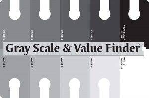
gray scale value finder

So, the colors in the semi-transparent non-staining category are adequate for a mid-tone palette, except for where darker passages require colors with values higher on the gray scale.

PAINT CHARACTERISTICS

Quinacridone colors leave a trace of color behind when lifted but will not stain other watercolors. So, Quinacridone Burnt Orange harmonizes very well with other pigments.

Semi-transparent non-staining watercolors have similar characteristics to transparent non-staining watercolors, but with a wider range of colors to add to a palette.

Quinacridone Burnt Orange can be layered in several glazes using other semi-transparent non-staining watercolors if each layer is allowed to dry thoroughly before applying the next layer.

COLOR MIXING WITH QUINACRIDONE BURNT ORANGE WATERCOLOR

Add Green Gold to Quinacridone Burnt Orange to mix a variety of earth-tone greenish brown colors. Add Aureolin or New Gamboge to lighten it. Also, try mixing it with Sap Green to darken it.

Mix Quinacridone Burnt Orange with Cobalt Blue or French Ultramarine to create interesting mid-value semi-transparent gray colors. For a darker gray, add a touch of Prussian Blue to the mix.

Quinacridone Burnt Orange can also be successfully mixed with watercolors in both the transparent and semi-transparent non-staining categories.

It also makes beautiful, luminous washes when glazed with the other watercolors in the transparent non-staining category.

Mixed with semi-opaque or opaque colors, it will create a combination that is cleaner and more transparent than using only opaque colors.

Purchase watercolor paints using my affiliate links below:

… and the recommended semi-transparent non-staining watercolor for mixing grays with Quinacridone Burnt Orange

… also the transparent non-staining category of watercolors for glazing or color mixing with Quinacridone Burnt Orange

To learn more about transparent watercolors, click the link to my blog post “Which Watercolor Paints Are Transparent.”

See my YouTube playlist “Watercolor Paint Characteristics & Color Mixing” for more videos. And, subscribe to my YouTube channel.

Categories
Color Mixing

Burnt Sienna Watercolor – Paint Characteristics & Color Mixing

Burnt Sienna watercolor is a warm, earth color that has a tonal value darker than the other browns in the semi-transparent category, Raw Sienna and Quinacridone Gold.

It is the “reddish brown” in the semi-transparent non-staining watercolor palette used for the glazing technique and mixing with other colors.

Measured against a gray scale value finder, semi-transparent non-staining watercolors are generally mid-light in value ranging from 20% to a maximum of 80% value.

So, the colors in the semi-transparent non-staining category are adequate for a mid-tone palette, except for where darker passages require colors with values higher on the gray scale.

PAINT CHARACTERISTICS

Burnt Sienna is slightly more opaque than transparent non-staining watercolors and requires more restraint to remain luminous when mixing with other colors.

Semi-transparent non-staining watercolors have similar characteristics to transparent non-staining watercolors, but with a wider range of colors to add to a palette.

Burnt Sienna can be layered in several glazes using other semi-transparent non-staining watercolors if each layer is allowed to dry thoroughly before applying the next layer.

COLOR MIXING WITH BURNT SIENNA WATERCOLOR

Add Aureolin or New Gamboge to Burnt Sienna to mix a variety of lighter value, warmer, more transparent brown colors that resemble colors in nature.

Mix Burnt Sienna with French Ultramarine to create interesting mid-value transparent gray colors. For a darker gray, add a touch of Prussian Blue to the mix.

Burnt Sienna can also be successfully mixed with watercolors in both the transparent and semi-transparent non-staining categories.

It also makes beautiful, luminous washes when glazed with the other watercolors in the transparent non-staining category.

Mixed with semi-opaque or opaque colors, it will create a combination that is cleaner and more transparent than using only opaque colors.

Purchase watercolor paints using my affiliate links below:

… and the recommended semi-transparent non-staining watercolor for mixing grays with Burnt Sienna

… also the transparent non-staining category of watercolors for glazing or color mixing with Burnt Sienna

To learn more about transparent watercolors, click the link to my blog post “Which Watercolor Paints Are Transparent.”

See my YouTube playlist “Watercolor Paint Characteristics & Color Mixing” for more videos. And, subscribe to my YouTube channel.

Categories
Color Mixing

Quinacridone Gold Watercolor – Paint Characteristics & Color Mixing

Quinacridone Gold watercolor is a warm, earth color that has a tonal value that sits between Raw Sienna and Burnt Sienna.

It is the “golden brown” in the semi-transparent non-staining watercolor palette used for the glazing technique and mixing with other colors.

Measured against a gray scale value finder, semi-transparent non-staining watercolors are generally mid-light in value ranging from 20% to a maximum of 80% value.

gray scale & value finder

So, the colors in the semi-transparent non-staining category are adequate for a mid-tone palette, except for where darker passages require colors with values higher on the gray scale.

PAINT CHARACTERISTICS

Quinacridone colors leave a trace of color behind when lifted but will not stain other watercolors. So, Quinacridone Gold harmonizes very well with other pigments.

Semi-transparent non-staining watercolors have similar characteristics to transparent non-staining watercolors, but with a wider range of colors to add to a palette.

Quinacridone Gold can be layered in several glazes using other semi-transparent non-staining watercolors if each layer is allowed to dry thoroughly before applying the next layer.

COLOR MIXING WITH QUINACRIDONE GOLD WATERCOLOR

Add Sap Green to Quinacridone Gold to mix a variety of earth-tone green colors that glow and vibrate. Also, try mixing it with Green Gold.

Mix Quinacridone Gold with Permanent Mauve plus Sap Green to create interesting mid-value semi-transparent gray colors. For a darker gray, add a touch of Prussian Blue to the mix.

Quinacridone Gold can also be successfully mixed with watercolors in both the transparent and semi-transparent non-staining categories.

It also makes beautiful, luminous washes when glazed with the other watercolors in the transparent non-staining category.

Mixed with semi-opaque or opaque colors, it will create a combination that is cleaner and more transparent than using only opaque colors.

Purchase watercolor paints using my affiliate links below:

… and the recommended semi-transparent non-staining watercolor for mixing grays with Quinacridone Gold

… also the transparent non-staining category of watercolors for glazing or color mixing with Quinacridone Gold

To learn more about transparent watercolors, click the link to my blog post “Which Watercolor Paints Are Transparent.”

See my YouTube playlist “Watercolor Paint Characteristics & Color Mixing” for more videos. And, subscribe to my YouTube channel.

Categories
Color Mixing

Raw Sienna Watercolor – Paint Characteristics & Color Mixing

Raw Sienna watercolor is a warm, earth color used to suggest shadows filled with reflected light and to float into moist washes of colors from the palette.

It is the “brown” in the semi-transparent non-staining watercolor palette used for the glazing technique and mixing with other colors.

Measured against a gray scale value finder, semi-transparent non-staining watercolors are generally mid-light in value ranging from 20% to a maximum of 80% value.

gray scale & value finder

So, the colors in the semi-transparent non-staining category are adequate for a mid-tone palette, except for where darker passages require colors with values higher on the gray scale.for where darker passages require colors with values higher on the gray scale.

PAINT CHARACTERISTICS

Raw Sienna is slightly more opaque than transparent non-staining watercolors and requires more restraint to remain luminous when mixing with other colors.

Semi-transparent non-staining watercolors have similar characteristics to transparent non-staining watercolors, but with a wider range of colors to add to a palette.

Raw Sienna can be layered in several glazes using other semi-transparent non-staining watercolors if each layer is allowed to dry thoroughly before applying the next layer.

COLOR MIXING WITH RAW SIENNA WATERCOLOR

Add Auerolin to Raw Sienna to mix a variety of lighter, warmer earth colors that are more transparent. Or, mix it with New Gamboge for more golden earth colors.

Mix Raw Sienna with Permanent Mauve plus Sap Green to create interesting mid-value semi-transparent gray colors. For a darker gray, add a touch of Prussian Blue to the mix.

Raw Sienna can also be successfully mixed with watercolors in both the transparent and semi-transparent non-staining categories.

It also makes beautiful, luminous washes when glazed with the other watercolors in the transparent non-staining category.

Mixed with semi-opaque or opaque colors, it will create a combination that is cleaner and more transparent than using only opaque colors.

Purchase watercolor paints using my affiliate links below:

… and the recommended semi-transparent non-staining watercolor for mixing grays with Raw Sienna

… also the transparent non-staining category of watercolors for glazing or color mixing with Raw Sienna

To learn more about transparent watercolors, click the link to my blog post “Which Watercolor Paints Are Transparent.”

See my YouTube playlist “Watercolor Paint Characteristics & Color Mixing” for more videos. And, subscribe to my YouTube channel.

Categories
Color Mixing

New Gamboge Watercolor – Paint Characteristics & Color Mixing

New Gamboge watercolor is a cheerful, semi-transparent non-staining yellow that is very versatile. Its color is neither warm nor cool in comparison to other yellows.

It is the “yellow” in the semi-transparent non-staining watercolor palette used for the glazing technique and mixing with other colors.

Measured against a gray scale value finder, semi-transparent non-staining watercolors are generally mid-light in value ranging from 20% to a maximum of 80% value.

gray scale & value finder

So, the colors in the semi-transparent non-staining category are adequate for a mid-tone palette, except for where darker passages require colors with values higher on the gray scale.

PAINT CHARACTERISTICS

New Gamboge is slightly more opaque than transparent non-staining watercolors and requires more restraint to remain luminous when mixing with other colors.

Semi-transparent non-staining watercolors have similar characteristics to transparent non-staining watercolors, but with a wider range of colors to add to a palette.

New Gamboge can be layered in several glazes using other semi-transparent non-staining watercolors if each layer is allowed to dry thoroughly before applying the next layer.

COLOR MIXING WITH NEW GAMBOGE WATERCOLOR

Add Viridian or Hooker’s Green to New Gamboge to mix a variety of green colors that resemble greens in nature. Mix it with reds for more interesting orange colors instead of using Cadmium Orange.

Mix New Gamboge with Mars Violet to create interesting mid-value transparent gray colors. For a darker gray, mix New Gamboge with Perylene Maroon plus Indigo.

New Gamboge can also be successfully mixed with the other watercolors in its semi-transparent non-staining category.

It also makes beautiful, luminous washes when glazed or mixed with watercolors in the transparent non-staining category.

Mixed with semi-opaque or opaque colors, it will create a combination that is cleaner and more transparent than using only opaque colors.

Purchase watercolor paints using my affiliate links below:

… and the recommended semi-transparent non-staining watercolor for mixing grays with New Gamboge

… also the transparent non-staining category of watercolors for glazing or color mixing with New Gamboge

To learn more about transparent watercolors, click the link to my blog post “Which Watercolor Paints Are Transparent.”

See my YouTube playlist “Watercolor Paint Characteristics & Color Mixing” for more videos. And, subscribe to my YouTube channel.

Categories
Color Mixing

Hooker’s Green Watercolor – Paint Characteristics & Color Mixing

Hooker’s Green watercolor is a pure transparent non-staining watercolor that is a warm, natural green that can be used as a primary green.

It is one of the “greens” in the transparent non-staining watercolor palette used for the glazing technique and mixing with other colors.

Measured against a gray scale value finder, transparent non-staining watercolors are generally light in value ranging from 10% to a maximum of 70% value.

gray scale & value finder

So, the colors in the transparent non-staining category are adequate for a complete palette, except for where darker passages require colors with values higher on the gray scale.

PAINT CHARACTERISTICS

The characteristics of Hooker’s Green differ in hue from one brand to another. Holbein’s brand has a yellow summer green color and Winsor Newton’s brand is cooler and darker.

Like other transparent non-staining watercolors, Hooker’s Green can be lifted from a dampened watercolor paper without leaving a strong stain behind.

COLOR MIXING WITH HOOKER’S GREEN WATERCOLOR

Add Aureolin or New Gamboge to Hooker’s Green to mix a variety of green colors that look more natural than using it straight from the tube.

Mix Hooker’s Green with Permanent Rose to create interesting mid-value transparent gray colors. For a darker gray, mix Hooker’s Green with Quinacridone Violet.

It also makes beautiful, luminous washes when glazed or mixed with the other watercolors in the transparent non-staining category.

Hooker’s Green can also be successfully mixed with watercolors in the semi-transparent non-staining category.

Mixed with semi-opaque or opaque colors, it will create a combination that is cleaner and more transparent than using only opaque colors.

Purchase watercolor paints using my affiliate links below:

… and the recommended transparent non-staining watercolors for glazing or color mixing with Hooker’s Green

… also the recommended semi-transparent and semi-opaque watercolors for mixing with Hooker’s Green

To learn more about transparent watercolors, click the link to my blog post “Which Watercolor Paints Are Transparent.”

See my YouTube playlist “Watercolor Paint Characteristics & Color Mixing” for more videos. And, subscribe to my YouTube channel.

Categories
Color Mixing

Viridian Watercolor – Paint Characteristics & Color Mixing

Viridian watercolor is a pure transparent non-staining watercolor that has a distinctive metallic blue-green color that is rarely used on its own as a primary green.

It is one of the “greens” in the transparent non-staining watercolor palette used for the glazing technique and mixing with other colors.

Measured against a gray scale value finder, transparent non-staining watercolors are generally light in value ranging from 10% to a maximum of 70% value.

So, the colors in the transparent non-staining category are adequate for a complete palette, except for where darker passages require colors with values higher on the gray scale.

PAINT CHARACTERISTICS

Viridian is considered to be a cool bluish green, that is tricky to mix when a warm green color is desired.

Like other transparent non-staining watercolors, Viridian can be lifted from a dampened watercolor paper without leaving a strong stain behind.

COLOR MIXING WITH VIRIDIAN WATERCOLOR

Add Aureolin or New Gamboge to Viridian to mix a variety of green colors that look more natural than using it straight from the tube.

Create special foliage effects by combining Viridian with a mixture of yellows, oranges, reds, and/or earth colors.

Mix Viridian with Rose Madder Genuine or mix Viridian, Cobalt Blue, and Vermilion together to create interesting mid-value transparent gray colors.

It also makes beautiful, luminous washes when glazed or mixed with the other watercolors in the transparent non-staining category.

Viridian can also be successfully mixed with watercolors in the semi-transparent non-staining category.

Mixed with semi-opaque or opaque colors, it will create a combination that is cleaner and more transparent than using only opaque colors.

Purchase watercolor paints using my affiliate links below:

… and the recommended transparent non-staining watercolors for glazing or color mixing with Viridian

… also the recommended semi-transparent non-staining watercolor for mixing with Viridian

To learn more about transparent watercolors, click the link to my blog post “Which Watercolor Paints Are Transparent.”

See my YouTube playlist “Watercolor Paint Characteristics & Color Mixing” for more videos. And, subscribe to my YouTube channel.

Categories
Color Mixing

Cobalt Blue Watercolor – Paint Characteristics & Color Mixing

Cobalt Blue watercolor is a pure transparent non-staining watercolor that has a distinctive color that is rarely used on its own as a primary blue.

It is the “blue” in the transparent non-staining watercolor palette used for the glazing technique and mixing with other colors.

Measured against a gray scale value finder, transparent non-staining watercolors are generally light in value ranging from 10% to a maximum of 70% value.

So, the colors in the transparent non-staining category are adequate for a complete palette, except for where darker passages require colors with values higher on the gray scale.

PAINT CHARACTERISTICS

Cobalt Blue is considered to be a neutral blue, neither warm nor cool, that can be used to tone down other colors it is mixed with.

Like other transparent non-staining watercolors, Cobalt Blue can be lifted from a dampened watercolor paper without leaving a strong stain behind.

COLOR MIXING WITH COBALT BLUE WATERCOLOR

Mix Cobalt Blue with Permanent Rose to create delicate transparent violet colors.

Add Aureolin or New Gamboge to Cobalt Blue to mix a variety of green colors that look more natural than using Viridian or Hooker’s Green straight from the tube.

Mix Cobalt Blue with Aureolin plus Rose Madder Genuine to create interesting light to mid-value transparent gray colors.

It also makes beautiful, luminous washes when glazed or mixed with the other watercolors in the transparent non-staining category.

Cobalt Blue can also be successfully mixed with watercolors in the semi-transparent non-staining category.

Mixed with semi-opaque or opaque colors, it will create a combination that is cleaner and more transparent than using only opaque colors.

Purchase watercolor paints using my affiliate links below:

… and the recommended transparent non-staining watercolors for glazing or color mixing with Cobalt Blue

… also the recommended semi-transparent non-staining watercolor for mixing with Cobalt Blue

To learn more about transparent watercolors, click the link to my blog post “Which Watercolor Paints Are Transparent.”

See my YouTube playlist “Watercolor Paint Characteristics & Color Mixing” for more videos. And, subscribe to my YouTube channel.

Categories
Color Mixing

Permanent Rose Watercolor – Paint Characteristics & Color Mixing

Permanent Rose watercolor is a pure transparent non-staining watercolor that has a reddish-pink color.

It is one of the “reds” in the transparent non-staining watercolor palette used primarily for the glazing technique.

Measured against a gray scale value finder, transparent non-staining watercolors are generally light in value ranging from 10% to a maximum of 70% value.

So, the colors in the transparent non-staining category are adequate for a complete palette, except for where darker passages require colors with values higher on the gray scale.

PAINT CHARACTERISTICS

Permanent Rose is redder and slightly darker than Rose Madder Genuine which has more blue in it.

Like other transparent non-staining watercolors, Permanent Rose can be lifted from a dampened watercolor paper without leaving a strong stain behind.

COLOR MIXING WITH PERMANENT ROSE WATERCOLOR

Mix Permanent Rose with Cobalt Blue to create delicate transparent violet colors.

Mix it with Hooker’s Green to create a beautiful transparent mid-value gray color.

Add Aureolin or New Gamboge to Permanent Rose to mix a variety of orange colors instead of using Cadmium Orange.

Permanent Rose can also be successfully mixed with watercolors in the semi-transparent non-staining category.

Mixed with semi-opaque or opaque colors, it will create a combination that is cleaner and more transparent than using only opaque colors.

Purchase watercolor paints using my affiliate links below:

… and the recommended transparent non-staining watercolors for glazing or color mixing with Permanent Rose

… also the recommended semi-transparent non-staining yellow watercolor

To learn more about transparent watercolors, click the link to my blog post “Which Watercolor Paints Are Transparent.”

See my YouTube playlist “Watercolor Paint Characteristics & Color Mixing” for more videos. And, subscribe to my YouTube channel.

Categories
Color Mixing

Rose Madder Genuine Watercolor – Paint Characteristics & Color Mixing

Rose Madder Genuine watercolor is a pure transparent non-staining watercolor with a crimson violet color resembling rose pink.

It is one of the “reds” in the transparent non-staining watercolor palette used primarily for the glazing technique.

Measured against a gray scale value finder, transparent non-staining watercolors are generally light in value ranging from 10% to a maximum of 70% value.

So, the colors in the transparent non-staining category are adequate for a complete palette, except for where darker passages require colors with values higher on the gray scale.

PAINT CHARACTERISTICS

Rose Madder Genuine, like other transparent non-staining watercolors, can be lifted from a dampened watercolor paper without leaving a strong stain behind.

Rose Madder Genuine is often used as a substitute for Alizarin Crimson because it is less intense, non-staining, and more permanent than Alizarin Crimson.

COLOR MIXING WITH ROSE MADDER GENUINE WATERCOLOR

Rose Madder Genuine mixed with Aureolin creates a glowing color substitute for Raw Sienna and Burnt Sienna watercolor.

It also makes beautiful, luminous washes when glazed or mixed with the other watercolors in the transparent non-staining category.

Rose Madder Genuine can also be successfully mixed with watercolors in the semi-transparent non-staining category.

Mixed with semi-opaque or opaque colors, it will create a combination that is cleaner and more transparent than using only opaque colors.

Purchase watercolor paints using my affiliate links below:

… and the recommended transparent non-staining watercolors for glazing or color mixing with Rose Madder Genuine

To learn more about transparent watercolors, click the link to my blog post “Which Watercolor Paints Are Transparent.”

See my YouTube playlist “Watercolor Paint Characteristics & Color Mixing” for more videos. And, subscribe to my YouTube channel.

error: Content is protected !!